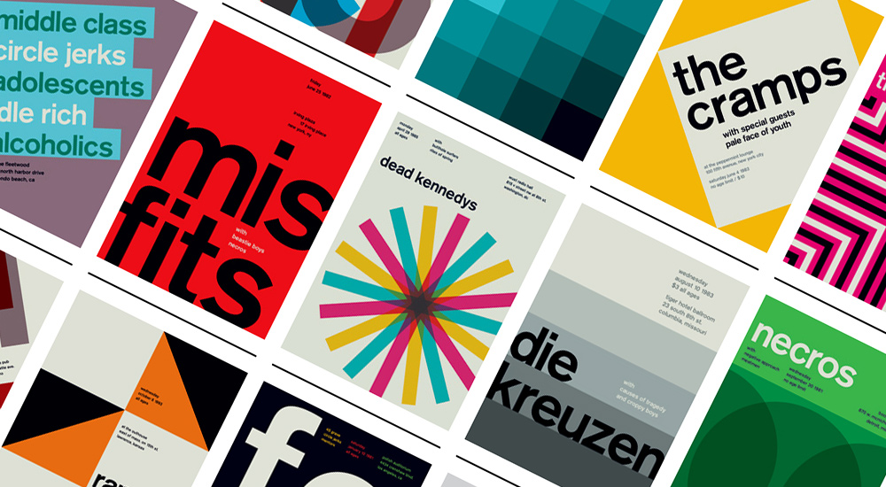
Surely not yet another redesign of something familiar into an established, classic graphic design trope? Of course. However these are not tired, they’re pretty brilliant. This is swissted – a ton of classic punk posters redesigned in the International Typographic Style. Not only has Mike Joyce of Stereotype Design tirelessly cranked out more redesigned posters than I care to count, but over 200 of them are available for purchase to adorn the wall of your choice. If I already didn’t have a ton of posters and prints I don’t have framed, much less mounted on my walls, I would jump at getting more than a couple of these.
Until then, view and buy, please let me live vicariously through you.
